
FUGITIVE PIGMENTS LIST! Lightfast tests, paint fading and understanding rating systems for watercolor.
Lightfast testing info, a fugitive pigment list, independent test results without paid sponsorships or brand loyalty. Many watercolors, gouache and acrylic paints claim to have a high degree of lightfastness. Large reputable companies are usually accurate with their ratings, but some companies lie, are misinformed or just make mistakes. Some business people are not artists, lack pigment knowledge or improperly evaluate results. You may be surprised to hear that some brands don't even test their paints, instead just copy results from published pigment ingredient studies. ASTM (an international testing organization) allows brands to reference their pigment list - even if the pigment was tested 10-30 years ago using a similar sample from a chemical company no longer in existence! Pigment powder manufacturers also self-rate their own products, which paint companies often blindly trust without verifying.
There are dozens of fugitive pigments misrepresented as lightfast. I will cover all pigments that have been flagged for fading, regardless of established ASTM LF (lightfast) or other BWS (blue wool scale) ratings. If you've got a large selection of colors, this guide may help you identify problem pigments in your collection. Some pigments vary slightly chemically by manufacturer (causing some brands of PR177 or PY3 to be more fragile than others). If you'd like to simplify your palette and not worry so much about random fading problems, check out my list of top recommended lightfast pigments.

Understanding lightfast ratings: Dyes or pigments are tested under direct sunlight (or under bright lights that mimic sunlight) until they absorb a set amount of UV light in order to assign number ratings to for the fading seen. The most common way to score this fading is called the "blue wool scale". This system was originally created for the textile industry to grade clothing dyes. A panel of blue dyes that fade at different rates serve as a reference card to estimate fading levels of anything compared to it. The BWS is placed under the sun/same UV conditions as the other colors you're testing. This generally runs for just a few months, but it's not a "time" duration, it's based on UV absorbed so it may take anywhere from 3 to 15 months to complete. Companies do not always use watercolor paint as the sample, the test pigment could be in plastic appliances/home goods, automotive coatings or printed enamel coated road signs.
If the BW1 stripe (the most fugitive dye, which fades on average within 3 hours to 3 days) fades at the same time as the color you're testing, the rating assigned is BW1 or LFV. If the colored object doesn't fade by the time the most lightfast BW8 stripe starts to fade, it is given a BW8/LFI "lightfast" score. Technically BW9 does exist, but is not commonly tested. LFI/LFII colors may have slight hue shifts or minor fading that become hard to discern when the before and after samples are separated from each other visually. BW7-8/LFI does not mean the color will never fade, but it's likely going to take over 150 years of indoor light to make it happen. Unfortunately, depending on the type of sample tested, it's possible that despite getting a score like BW7-8 if it could actually be BW3-5 (LFIII to LFV "fugitive") if it had been correctly tested diluted. The color could also fade drastically differently over a longer period of time when compared to other pigments that initially received the same rating.

I have only seen ASTM (and the respectable company called Golden, the makers of Qor) openly hold themselves to the modern standard of testing materials diluted (with water for watercolor, or in pale white tints for acrylic). Golden tests all their paints in multiple tints down to a 20:1 diluted rate, multiple exposure methods (including Xenon Arc machine as well as AZ/FL outdoor tests in variable UV/heat/weather). Golden even continues tests past 3 years as well as verifying batch to batch stability - a standard all paint companies should strive for! (Resource: Just Paint Blog.) Many companies around the world are essentially cheating on lightfast ratings by self-testing their colors in thick, full-strength, masstone layers that are more resistant to fading.
Video error clarification: I said the word "refract" around 2:30 (I often think of that term when light changes direction/is reflected back at me). It should be "fluorescence" (PO64 will "fluoresce" under UV light). The pigment particles get excited under black light which causes them to have a glowing appearance. Fluorescent colors (often called neon or opera) are typically fugitive.
Most brands made in the USA label UV stable colors as ASTM "LFI" to "LFII". ASTM is now international, but was formerly referred to as the American Society for Testing and Materials. They have one of the only systems where the lower number is better. Written in roman numerals on a scale from I-V. LFI and II being lightfast, III being borderline/fair and IV-V being fugitive. Despite going in the opposite number order, ASTM ratings are based on the Blue Wool scale (numbered 1 through 8 where BW1 fades the most, BW8 fades the least). Star systems with ratings like "+++" or *** (of 3 stars) or ***** (of 5 stars) in a star system that works like review ratings where more stars is better. The amount of stars and method of testing varies based on the brand/country of origin, each company decides which system they prefer.

How my tests are done + why 1 year? Isn't that too long? My tests receive daily direct sunlight through glass (no uv-blocking treatment) in the generally sunny, high uv-index state of Florida. To establish my own system of fair, standardized evaluation, the duration is set to 1 complete year. Somewhat equal UV exposure occurs over the course of a year, spanning all seasons of varying sun strength. This allows for the the same comparable conditions for each brand, regardless of start date. This duration is even more important in Northern area home tests with a lower UV-index (sun is stronger by the equator, where shorter tests can fail to detect "fair" LFIII colors. I test both masstone (full strength) and diluted with purified water to roughly 35-50% color strength, or a 1:10 to 1:20 paint:water ratio on acid-free cotton paper (Arches). This paper is free of optical brighteners (doesn't yellow over time like "extra white" or Bee brand papers).
A year may sound like a long time, but home tests in normal windows are not directly comparable to the time shown on the chart above. ASTM sky facing sunny Arizona or roof-top tests receive many more hours of daily sunlight than home vertical window tests and average 3-4 months to complete (that's in a high uv-index state, during the most sunny season in hot desert sunlight, with little to no rain). On average a S/SW sunset facing window may only receive 3-5 hours of direct sun beams per day (in certain seasons and only when it's not rainy/cloudy in the evenings). Based on my studies with a BWS dye panel, it appears that 1 year in a vertical window may only average an extra couple months than standard 3-4 month skyward testing. This slightly extended time can make fading levels more clearly visible to the eye, helping you see minor fading differences between LFI-LFII colors. Those barely discernable changes could be missed earlier on. You may even discover that there's such a thing as colors that are superior within the LFI testing range (basically a range we don't test for - LF0/BW9).
You may hear that "any color fades in sunlight eventually" and while that's true, a great many lightfast colors can withstand 2-3 years or more of sunset-facing window testing without significant fading. I don't recommend putting your paintings outside, but there's no reason not to test them harshly so you can be confident in your work. While I do periodically run blue wool panels for reference, I believe my duration-stated method of testing indicates a more relatable time estimate for the average artist. On this site, I'll only mention BWS info when it notably contradicts published ratings, such as in the case of PO64. Otherwise I'll report fading based on 3, 6 or 12 month test intervals. Set duration tests help establish real-world fading time frames of artwork hung on a home wall receiving natural light (not in comparison to abstract ideas like abnormally low-light "museum" conditions or timeframes based around "the fading of historical pigments like alizarin crimson or rose madder"). BWS/ASTM tests were only designed to detect the most fugitive, fast fading colors. They miss many marginal LF colors that will also be a problem for artists, particularly watercolorists using them for subtle diluted washes.
Even art hung indoors has the potential to fade quickly (particularly art made with dye based liquid watercolors, most markers, neon or LFIV-LFV pigments). Fugitive colorants can show visible fading within several weeks in a window. Any pigments showing fading in window tests will eventually fade on indoor walls due to the light of a nearby window. It just takes a bit longer than it did in direct sunlight. Indoor fading can be drastic if closer to the equator or near waterfront UV reflection. Fading can become visibly dramatic in less than a few years in rooms with large windows such as business offices, restaurants and living rooms with sliding glass doors. If my test shows notable fading (comparable to LFIII-V rated colors at 1 year) it is likely that just 1-2 hours of daily light beams from nearby windows (sunrise/sunset) would result in visible damage to indoor wall art within the next decade. This is a more practical way to think of lightfastness than the blurbs often placed on paints, where they estimate LF ratings in terms of lasting through "100 years of museum lighting" (that's much less light than the average livingroom).
I have seen colors start to fade at variable rates after long term exposure (certain pigments are more prone to fading over the course of prolonged repeat exposure, breaking down at different rates after 6 months). Some light machine tests are done with limited heat and humidity which do not account for real-world storage situations. Because of this, I do not recognize the validity of short duration tests. ASTM results include skyward facing outdoor tests performed in AZ or FL state sunny hot climate daytime exposure (ending at a cut off of roughly solar irradiance measurement 1260 MJ/m², or completing in as little as 3 months). In my experience stopping at this set limited duration has resulted in some problem colors not being detected. Sometimes a color may not seem to be a problem this early. Most BW6, 7 and 8 colors are stable or have very little fading/hue shifts by 1 year of normal window light (vertical home windows, not outdoor sky facing boxes). By allowing your home tests to run for 1 year you'll get a better picture of how lesser rated pigments really compare to more lightfast ones. There are a lot of amazing pigments that won't fade in long term tests. Hundreds of Daniel Smith colors, even a good portion of my cheaper Paul Rubens 48 pan, set have spent 2+ years in my window without showing any signs of fading! Long term tests will help you understand which colors are truly durable.

Acrylic paint can initially appear to have more light resistance due to the thick masstone application plus a polymer binder that serves as a light refractive waterproof coating. A pigment stated to be max lightfast in acrylic, could be clearly fugitive in watercolor. Pyrrol Orange PO73 is rated as perfectly lightfast in all mediums, but even it fades if exposed to prolonged repeat sunlight exposure when very diluted. I've heard people say that "watercolor is more fugitive than other mediums", mostly because watercolor most often utilizes pigment in its most vulnerable diluted state... BUT watercolor is not always fugitive.
There are over a hundred lightfast pigments used in watercolors that can withstand daily direct sunlight for several years or more! A thick application of a pigment in acrylic may have its top layers fade first. This degradation is not clearly visible for a long period of time. A manufacturer could determine a pigment to be "lightfast", but later if an artist dilutes it to a thin watery layer they may discover it actually fades. It was never truly a lightfast pigment, it will just take longer to fade in a thick layer. Therefore, lightfast testing of both masstone and diluted watercolor paints is one of the best indicators of the UV durability of a pigment.

PROBLEM PIGMENTS QUICK LIST: Organized by pigment code (color family, then chemical ID number). Learn more about what C.I. (color index) code numbers mean on the pigment database here. Red pigments tend to fade the most often (the red end of the color spectrum absorbs the most UV light) and blue to black pigments tend to be the most stable. This is part of the reason there are so many notable fading issues with red colors. There are exceptions to this, any color group may contain a fugitive color. Even some blues are unstable, such as lake pigments (salt bound dyes) and fragile plant dyes like Indigo Blue. It's a generally good rule of thumb to avoid red/pink/orange paints in bargain sets with no pigment info (Prima/Kuretake/Sakura etc.).
--- PB1 Victoria Blue / "Blue Lake" ---
--- PB17 Phthalocyanine Cyan ---
--- PB27 Prussian Blue ---
--- PG8 Nitroso Green ---
--- PO13 and PO16 "Benzidine" Orange (and Red Shade) ---
--- PO17 Orange Lake/Naph/Barium lake of azomethine dye ---
--- PO64 Benzimidazolone Orange ---
--- PR3 and PR12 Toluidine Red and Permanent Bordeaux ---
--- PR48 and PR48:1 variants of Permanent Red ---
--- PR81 Rose - Rhodamine lake dye salt variants (PR81:1through PR81:4 = LFIV-V) ---
--- PR83 Alizarin Crimson ---
--- PR112, PR170 and PR184 + less common "Naphthol" related Reds like PR2 and PR4 ---
--- PR176 Benzimidazolone Carmine, also "Alizarin Hue" ---
--- PR177 Anthra Red ---
--- PR242 Disazo Condensation Scarlet, also "French Vermillion" ---
--- PY1 Hansa Yellow (less stable than PY3 variant) ---
--- PY17, PY55 and PY83 types of "Diarylide" Yellow ---
--- PY40 Aureolin Yellow ---
--- PY74 Arylide Yellow ---
--- PV1, PV2 Rhodamine dye based salt variants ---
--- PV3 Methyl Violet ---
Natural and antiquity ingredient codes:
--- NB1, PB66, VB1 natural and synthetic Indigo Blue. Previously labeled as "Vat Blue 1" before color index standards (MaimeriBlu, Utrecht). ---
--- NBr8 (Vandyke / Van Dyck Brown a many-mineral brown earth mixture including fugitive coal and peat). ---
--- NR4 Carmine or Cochineal ---
--- NR9 Rose Madder (root plant) ---
Mineral paints and rarely used pigment ingredients without assigned color index numbers: Some fugitive ingredients are not used commercially often enough to have been registered for a pigment code. This includes paints such as Daniel Smith's Primatek, some Roman Szmal mineral watercolors, handmade paints from Kremer mineral or gemstone pigment powders. Turner and D.S. offer modern "Mayan" colors that may have been assigned codes after production. This means the labels and color charts of these companies do not specify a number, though the Color Index association may have assigned this chemical a code that can't be verified with the paint manufacturer.
--- Rhodonite, Sicklerite and "Mayan" Colors ---
Chemically unstable colors (flagged as possibly fading due to reasons other than simply UV light). Fading from any environmental reason such as heat, PH changes / acid, humidity etc. I attach my lightfast tests to boards with a spacer so they do not press against humid glass. I have verified some issues with secondary tests performed in northern states (PA instead of FL) to help determine if heat/humidity levels were the main factor in fading. This ended up being important in the case of PV14 Cobalt Violet, which passes most tests in cooler northern climates yet will fade on artwork stored in the humid, sunny south.
Be aware that there are chemical reactions possible in otherwise reliable paints that I have not yet detected (such as the fact that Cadmiums have been known to fade in humidity). Air pollution, acidity, PH levels and exposure to certain metals or honey based binders can cause hardening and yellowing in minerals like Malachite, Vivianite and Azurite.
--- PG24 Ultramarine Green Genuine --- *hot/sunny environments.
--- PV14 Cobalt Violet --- *hot and humid environments.
--- Sodalite, Malachite, Vivianite and Azurite --- *humidity, acid, honey binder sensitive.
Caution pigments, circumstantial or brand specific: The following pigments may require self testing due to variations by brand/pigment manufacturer or display scenario.
--- PO73 Pyrrol Orange --- Only in question for very diluted washes or tints in outdoor/mural settings, where the directly lit project requires more than 1 year without fading.
--- PV23 Dioxazine Violet --- There are some brands using cheap fillers and poor manufacturing processes for PV23 that give it a bad name. Nearly all reputable watercolor brands carry excellent LFI-LFII versions of PV23 (DSmith, M.Graham, Schmincke, RSzmal etc. do not fade)... BUT cheap paints from Superior/Etchr and student grade sets have labeled some purples as PV23 that faded LFIII-IV. Buy this from trusted sources only, or be prepared to test it yourself.
--- PY3 Hansa Yellow --- Caution. Golden, the maker of Qor watercolors, has decreased the rating for PY3 to "fair" instead of excellent after random batches of PY3 producing fluctuating LF test results (source article on their blog here). I have yet to have any brand of PY3 dramatically fade, however there seems to be both paint brand/pigment manufacture variance between batches. If using PY3 you may want to run short 3 month window tests on new tubes to be sure your batch is not faulty. I personally switched to PY175, a brighter lemon hue, because I fell in love with Holbeins Imida Lemon or W&Newton's Winsor Lemon. If transparency is not a concern, the more opaque Cadmium Yellows like PY35 are also highly lightfast.
Other fugitive colorants:
Dye based products such as Ecoline, PH Martin Radiant, fountain pen inks etc.
All "fluorescent" or "neon" colors. Includes "opera pink", and colors sometimes noted as "brilliant" in watercolor and gouache paints. Sometimes invisible dyes in a resin base or optical brighteners are added to paints marketed for their "glowing" UV black light effect. This reactivity to black light is fugitive, where sometimes the underlying secondary pigment is lightfast. Often pr122 is a stable secondary color in "opera" or neon pink but the other ingredient (a fluorescent dye) fades. There's the unique case of PB15 being stable in manganese blue hue/lunar blue by Daniel Smith, despite the fluorescent optical brightener fading over time (which happens to be clear/colorless so it doesn't notably damage the paint in normal lighting). Blue Apatite genuine also has some naturally occurring fluorescence (likely part of the fluorite mineral) which is the only part of this color to fade over time.
Other paint, inks and colored pencils sold without an ingredient list: Bargain, kids and student grade paints that do not have pigment codes listed should be assumed fugitive. Even products like acrylics and calligraphy ink that say "lightfast" (but don't provide ingredients) should be independently tested. Smaller, lesser known brands, are particularly bad about casually writing "lightfast" on their entire color selection. A good example of this is Ziller Ink, sold on Blick, as waterproof acrylic for drawing and calligraphy. Because waterproof drawing inks may be of interest to watercolor painters, I want to warn you about these inks being fugitive:

What is lightfastness and why does it matter? In general, when a color is labeled as lightfast it means that it will not easily fade when exposed to UV (natural sun light, not indoor lamp light). I often hear people dismiss lightfastness as something that might happen "years from now", but fugitive colors can fade very quickly (as little as several days for dyes or months for pigments) This is really important if selling your art to someone who may hang it in a bright business office, restaurant, shop, gallery or home with a lot of glass windows. A 3 month window test allows you to detect fading in the most fugitive colors. Many colors that will fade over time will show signs before 1 year. Be wary when someone says they did a lightfast test for a short duration (days, weeks or even a month is not enough - only LFV dyes may show fading in this short of a time).

Krylon UV spray does not work. Thick coatings of resin OR minimum 3 to 6 layers of Golden's UV varnish are capable of distorting light enough to protect watercolors and dye inks from fading, BUT can also reactivate and ruin paintings if not delicately applied. UV glass is a scam, as most affordable picture frames that mention UV may or may not have a spray coating that does very little (there is no standard in place and my tests have shown little to no efficacy). Only expensive museum grade glass that is cost prohibitive to the average artist is effective, as well as thicker tinted glass made for cars/house windows. It's cheaper and easier to use lightfast pigments in the first place, rather than try to seal/frame/fix problems later.
What if you just want to practice in a sketchbook/make prints? You could use fugitive paints, but consider this - it is sometimes assumed that lightfast paints are more expensive or that they are only available in pro grade paints. This is not always the case, but it's easier to tell which ones will fade before purchasing in pro grade paints because ingredient labels are more detailed. Van Gogh on Blick here - offers lightfast watercolors for just a few dollars a tube. You may see both cheap and expensive brands offer mixed selections of lightfast and fugitive pigments. It is often just as affordable to buy lightfast paints as fugitive ones (such as avoiding the low rated ones labeled as * of *** stars in the White Nights watercolor catalog). Many colors that would fade can be easily replicated by stable ones instead. The exception to that is neon or fluorescent colors, which are abnormally bright, often including man-made dye additives. There are no lightfast pigments that can replicate their vibrancy. Any art sold using them should have a note in the listing advising the buyer to avoid storing it near window light. It is unfair to assume that buyers (and likely non-artists) know about pigment vs dye properties and fading potential.
FUGITIVE LIST in detail with test result images:

--- Phthalocyanine Cyan PB17 ---
Not to be confused with PB15 or PB16 Phthalo variants which ARE lightfast. This Phthalo version PB17 is less stable in its diluted range. It used to be carried by Holbein in watercolor form, but now is limited to their gouache (available in two variant shades including the deep valued "Katsura Blue" and lighter "pure blue"). Paul Rubens, Superior and Super Vision offer PB17 in their watercolor pan sets. All of which are Chinese brands, so it's likely the pigment is still made there and I could not find it anywhere else.
Be aware that other pigment databases provide out of date information (such as Handprint and The Color of Art Pigment Database). They had listed this pigment as LFI and only tested Peacock Blue, the discontinued Holbein color that hasn't been available since 2005. The modern versions fade in tints and diluted (notably fades when pigment is mixed with over 50% water within 1 year). I recommend PB16 offered by a handful of pro watercolor companies like Daniel Smith, Schmincke, Da Vinci or Winsor and Newton instead. PB16 is copper free and better for marine environments in addition to being lightfast, so I overall find it superior to PB17.

Some student brands like Daler Rowney Aquafine, as well as Winsor and Newton Cotman, seem to have unusual texture problems as well as dramatic irreversible fading.

Prussian Blue pigment has a chemical reaction to UV light exposure. It is different than the standard fading that happens in other pigments. This is caused by the oxidation of ferrous ferrocyanide salts. Sun bleaches the FeIII (Iron) which requires time to re-oxidize away from light. Because it is possible to regain color intensity over time in shade, manufacturers have lazily marked it as LFI.


Possibly the most widely misrepresented color, Prussian Blue is almost always labeled as LFI / max lightfastness. Some brands have honestly made an attempt to make a note about it's odd tendency to fluctuate in color (thank you Winsor and Newton), but most have no warning that it fades in light and recovers in shade.

The down side to this warning is that it's not enough information. The problem I've found in my testing is that all brands fade, but only some brands make a nearly full recovery after prolonged shade. The return to the original color can take as little as days, but some brands stay faded indefinitely. This variable is too great to be considered a lightfast pigment. Nor should you have to take a painting off the wall for a nap for it to be considered stable.
Also called Hooker's or Sap green. Green in White Nights watercolor is one of the deepest valued and light stable versions of this pigment with fading only equivalent to LFII in masstone and LFIII in diluted ranges, often performing much better than colors known to be fugitive like Alizarin PR83.

Shinhan PWC / SWC professional watercolors have two options for PG8 Nitroso Green pigment. These colors, called Sap Green and Hooker's Green vary slightly in hue AND in lightfastness. Hooker's Green variant seems to be less lightfast and more easily replaced by Phthalo Green PG7 or PG36. Sap Green has a darker and warmer hue, as if mixed with a yellow for a natural leaf color. In their masstone range these colors can have LFII to LFIII fading, increasingly fugitive as diluted.
--- Benzidine Orange PO13 (+ PO16 red shade variant) ---


PO13 and PO16 versions of Benz Orange are commonly found in bargain/kids/crafter grade paints including Prima Art Philosophy. It is also available in some "designer" gouache or intentionally vibrant options of watercolors by ShinHan (who has a tendency to prefer bright colors over stable ones in their entire catalog). Though the watercolor set called "Confetti" by Prima is one of the most overall fugitive selections I've ever seen in any brand. Many of the colors in that set fade within a few months, some so completely that it doesn't look like paint was ever on the paper.

Even using this color thickly in masstone will not save it from completely disappearing over time. I'm hesitant to even use it for card making, because diluted it can fade within weeks and if someone had their handmade birthday card sitting on their office desk for a while...
--- PO17 Orange Lake ---

A pigment often found in inexpensive or student watercolors and designer gouache, like Sonnet or Ladoga from Nevskaya Palitra. I expect this may be removed from the White Nights line in the future, as they continue to improve White Nights catalog as their "extra fine professional" line.
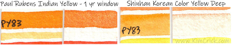
--- Benzimidazolone Orange PO64 ---
A new pigment that started popping up in a few professional watercolor brands between 2017 and 2020. Currently rated with max stars in White Nights and Rembrandt brands, but shows fading in masstone equivalent to LFII results. Most significantly, the diluted range (approx. 50% water) starts to fade in as little as 1 month, which is closer to behavior of colors normally rated LFIII to LFIV. The diluted test result for PO64 shows drastic fading, undeserving of it's BW7-8 rating being passed along to artists.

In comparison, most lightfast paints can be exposed to multiple years of general daytime sun exposure without showing any signs of fading. LFII paints have minor signs of fading by 1 year. Over 200 colors in Daniel Smith's watercolor line show zero fading despite having faced sun exposure for over 2 years.


This modern pigment has not had enough testing for the LFI-II/max star rating to be taken seriously. I have done multiple tests and in masstone it has only minor fading, when diluted it fades MUCH faster. Called "Saturn Red" by Schmincke Horadam, "Brilliant Orange" by Rembrandt and "Orange" by White Nights.

White Nights also put it in their color called "Peach" (a pastel mixture with white - which is particularly fugitive due to the pre-diluted mixture).
--- Toluidine Red PR3 and Permanent Bordeaux PR12 ---
Used in Shinhan Korean Color watercolor paints in "Carmine" and "Crimson" colors.

Shinhan has used PR12 and PR184 in red mixtures with PR3, a particularly fugitive combination. This can result in so much fading it's like nothing was ever painted after about 1 year.
--- Perm. Red PR48 and PR48:1 variant ---
LFIV used in ShinHan, Holbein and Renesans watercolors often called "Scarlet Lake" or "Carmine Hue". There are times where a manufacturer might increase the LF rating by adding a lightfast pigment to a mixture. This is another reason to be suspicious of ratings, particularly in multi-pigment mixtures. Unfortunately there is very little PR108 (the lightfast Cadmium Red) in this mixture, so the fading was quite extreme:

--- PR81 White Nights Rose - and any other brand's Rhodamine lake dye salt variants (PR81:1through PR81:4) = LFIV-V ---


PR83 was offered in almost every major brand of paint for decades as a rose-red color loved by botanical artists. It can show extreme fading when diluted with water (about 50% water to paint ratio):

Many companies have changed their paints to be called "Alizarin Permanent" when they switched the pigment ingredient to a similar, slightly more stable red such as PR264 or PR177 mixtures. I like Winsor and Newton's PV19 and PR206 combo because of its superior lightfastness. Be aware that the more common replacement - PR177 - is still prone to fading in it's diluted range but has a more stable masstone than PR83 had. The original PR83 pigment, by popular demand, is still offered by many brands though it is often appropriately labeled as fugitive LFIII to IV at this point.
--- Naphthol Red variants including PR112, PR170 and PR184 or less common student/bargain grade variants like PR2 and PR4 (recently removed from brands like White Nights, but still present in other lines like Sonnet/Ladoga or ShinHan) ---
These pigments (similarly to PR177) have a tendency to fade in tints or when diluted with water. Often marked as LFII-III, can vary greatly based on pigment source and thickness of application.
PR2 and/or PR4 - Present in Sonnet or Ladoga Scarlet/Red Light, LFIII masstone, LFIV diluted. Visible signs of fading in window tests within 1-3 months.
Naphthol Red AS-D PR112 is sometimes called Naph Scarlet, Carmine or even Cadmium Red Hue. Rated LFII in acrylic/oil, LFIII in watercolor, with severe fading when diluted in any medium.
Naphthol Red AS PR170 also called carmine or crimson in some brands is rated as LFIII with scores as low as 4 on the Blue Wool Scale in tints. This pigment can vary chemically, with some brands having stronger lightfastness. The opaque form (F3RK) usually noted as PR170-F3RK on a label, is said to be the most lightfast version. I have seen this less fugitive "-F3RK" version used in student grade paints, such as Liquitex Basics acrylic.

White Nights watercolor uses the one that easily fades in tints/diluted, such as their pastel color "Rose Quartz:

Naphthol Rubine PR184: Shinhan Korean Color (gansai-like watercolor paints) have a particularly fugitive mixture using this pigment (see PR3) called "Crimson 2". Neither PR184 nor PR3 remained on the paper after 1 year in a window. Brief daily sun erased them clean from existence.
(No individual PR184 sample, see PR3 mixture.)
--- Benzimidazolone Carmine or Alizarin Crimson Hue PR176 ---
Offered by Lukas and Daniel Smith in watercolor form. Like many reds, this pigment suffers the most when diluted. It is easy for PR176 to pass most lightfast tests due to it's strength in masstone. It has a tendency to hue shift towards blue before fading completely when very watered down in long term tests.

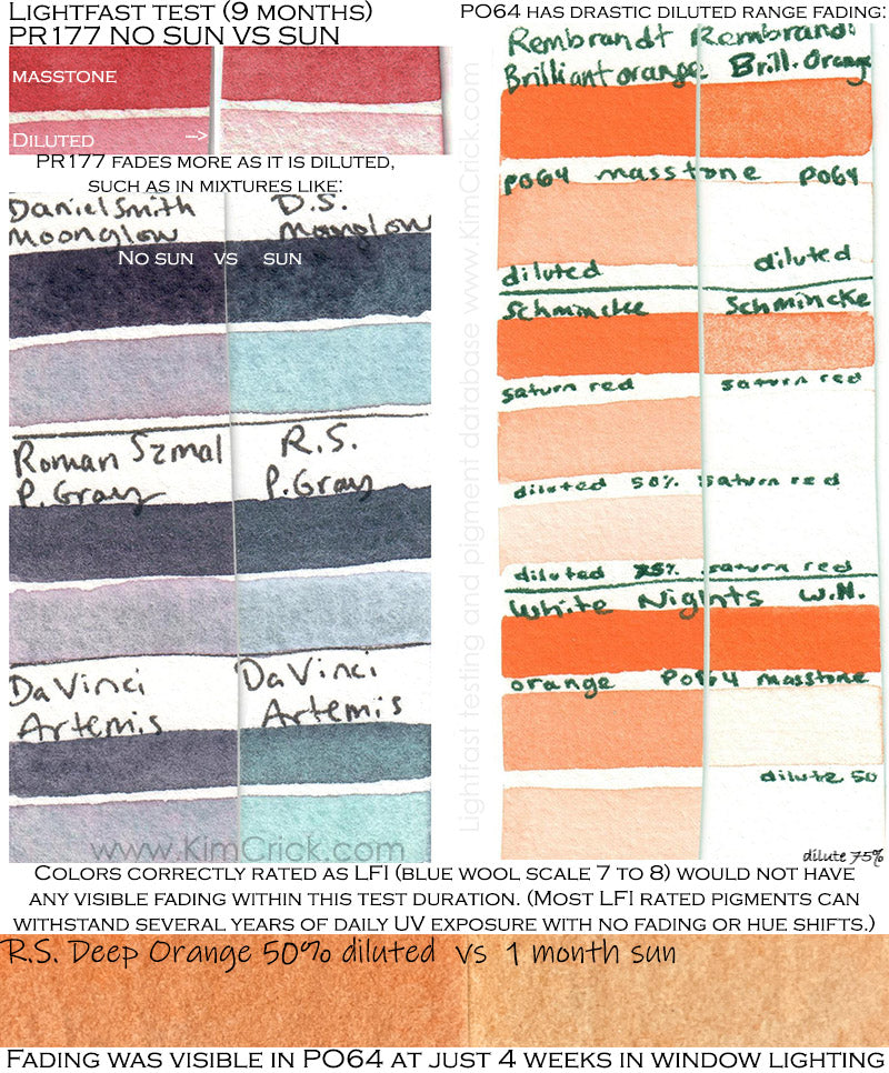
--- Anthra Red (Anthraquinone) PR177 ---


The use of PR177 is not very common as a single pigment red choice. It's rarely available as a red in pan set assortments, but it is used in convenience mixtures. The most popular of those mixtures is Daniel Smith's Moonglow which is rated as LFI however this is incorrect. PR177 has a tendency to be more stable in masstone, and it's original pigment rating stems from it's use in acrylic and oil paints. Diluted it is known to be closer to LFIII in watercolor paints (which is also reflected in the notes of other popular pigment database sites like Handprint and The Color of Art Pigment Database if you're looking for further tests/info).

In my test I can clearly see that the red component of this mixture has faded away after indirect general daytime window lighting within 1 year. Regarding Moonglow's LFI rating, this should have meant no changes within this time frame. I did notice that in Daniel Smith's materials, it's also commonly noted as "NR" in color charts and dot cards meaning "not rated in ASTM". This implies that at least one pigment was never thoroughly tested in all mediums/tints/diluted, yet they are passing along a guess (without testing it themselves? or have they...). It's hard not to feel like this is intentionally misleading. The comparison of how this color fades when up against paints they rated LFIV (poor lightfastness) concerns me:

Unfortunately in recent years this color has gained so much popularity among artists that this unusually color-separating and granulating mixture containing PR177 has been copied by other brands such as Da Vinci and Roman Szmal Aquarius (who also labeled them as lightfast). It's possible that a pigment manufacturer (such as Kremer Pigments, or a automotive coatings company) rated this pigment as highly lightfast after testing it in masstone in acrylic or oil paint, which could be a very different result from diluted watercolor.


A note about Daniel Smith Moonglow "dupes" "knock-offs" "look-a-likes" vs "inspired by" paints by other brands. Daniel Smith has had a lot of success over the past decade and a great many watercolorists have celebrated their color-separating convenience mixtures. This has not gone unnoticed by other brands, and colors just like Daniel Smith's Moonglow, Shadow Violet and Imperial Purple are popping up in other brands catalogs. Sometimes the way these colors are named along with their mixtures is a fairly straightforward "dupe" or blatant mimicry. The closest Moonglow-like mixture in hue and pigments used is from Da Vinci which they called "Artemis". There are two other brands with similar colors to Moonglow - Roman Szmal Aquarius "Przybysz's Grey" which does include the PR177 and PB29 but swaps out the PG18 for Cobalt Green PG26.

*Shadow Purple likely includes PR177, but is not labeled*
The other similar color to Moonglow is Paul Ruben's Shadow Purple (which is named oddly considering P.Rubens also has a "Moonlight Purple" that is similar to D.Smith's Shadow Violet. Yes the names seem switched, more about that later under PO73.) This color contains more Ultramarine and leans more Blue than the other look-a-like paints. The big problem with Paul Rubens dupe is that it is incorrectly labeled as only containing PB29 and PG18 without any mention of the red it obviously contains. Is it PR177 just like Daniel Smiths? Probably, but it could also be a dye and therefore not disclosed under pigment info.
Because each pigment manufacturer has access to different raw materials all of these paints vary in how they look and perform. Part of the issue for all of these paints is that some of the ingredients are natural minerals which change batch to batch or mine to mine. A pigment mined in one part of the world is never exactly the same as a pigment mined in other, for example red iron oxide the red rock of a mountain in Arizona may look completely different from one in Spain, yet will both be labeled as PR101 since they are chemically the same thing. In this regard, buying "dupes" or the same pigment code paints from multiple brands may actually be worthwhile if they are different enough.

Above: A problem that I noticed with color separating paints is the fact that they also separate within the tube over time. The lighter, thinner particle PR177 often separates out with the liquid binder away from the heavier PG18 Viridian and PB29 Ultramarine Blue. If you are not often mixing these back together (ideally a toothpick or a lot of kneading) each sample you remove from your tube will be gradually a different color. This means that some of your paintings may be much more fugitive than others (if the paint released from the tube that time had a higher content of PR177). Here is an extreme example of a tube that was allowed to sit for over a year. This of course would be less severe for less time/more frequent mixing, but is also something to be aware of when you see color comparisons online. It was not enough to knead/press on the tube, I had to put a toothpick in and thoroughly stir it back to it's original color. I recommend mixing your own version of this color using the single pigment ingredients (and perhaps Schmincke's "French Ultramarine" for the PB29 which has particularly active granulation texture) along with a more lightfast red or violet. I'll be doing some tests with PR122 and PV19 in the future.
--- Disazo Condensation Scarlet, also called French Vermillion PR242 ---
This pigment may vary slightly by brand. It's also more or less stable depending on the amount diluted. It appears to be very sensitive once it hits about 20% pigment to 80% water ratio. It appears to go from borderline lightfast when in masstone or slightly diluted, to completely fugitive when very diluted. Here is a one year lightfast test of White Nights Coral color, as well as Lukas Permanent Red:


Much more prone to fading than the more common PY3, Hansa Yellow 10G. I have seen drastic fading in the diluted range of Paul Rubens "Yellow Light" PY1.

--- Diarylide types of Yellow PY17, PY55 and PY83 ---
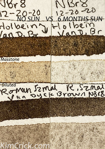
Several Asian watercolor companies (such as Paul Rubens, Superior and Shinhan) use PY83.
Shinhan Korean color uses PY17 in mixtures, such as in "Green Dark". It darkens slightly in masstone, but completely disappears when diluted with 50% or more water to pigment ratio.
--- Aureolin (Cobalt) Yellow PY40 ---


PY40 doesn't just fade, it discolors into a dull brownish gray. This can cause paintings to appear dirty as if they have suffered water damage over time and completely alter the artists original color harmony. (Test images show Winsor and Newton's then Daniel Smith's 1 year results.) While some companies still mark this paint as LFII, it is widely regarded as a pigment to avoid for traditional art for sale/wall display. With so many alternative yellow pigments out there, I would avoid Aureolin. Note that some brands have paints called "Aureolin" "Aureoline" "Aureolin Hue" etc. that have been updated to use a more lightfast pigment instead (such as White Nights or Rembrandt's Aureoline PY150). These new lightfast "hues" (a look-a-like replacement pigment) are often not suggested by the color name. This poor choice in wording may hurt the marketing on those colors for those who don't look at the pigment ingredient and just assume it's PY40.
PY74 is often used as a primary mixing yellow. While often independently rated high, this pigment can suffer in tints / diluted. In some colors, like Paul Rubens Yellow Green, where only a tiny amount of PY74 was mixed with PG36, the yellow part of this mix has totally disappeared over a year.

I prefer Sennelier's PY153 or Holbein's PY175 as mixing yellows instead. See my choices for top lightfast pigments here.
--- PV1 or PV2 Rhodamine ----
Rhodamine dye based salt pigments/lake. These vibrant purples are often used in student grade or cheaper paints, such as Sonnet or Ladoga. These colors can darken in masstone or fade in tints/diluted, but generally start to have appearance changes within a month of daily sunlight. If looking for a more durable strong, smooth, non-granulating purple - I recommend PV23 Dioxazine Violet from a reputable company (like DSmith, Schmincke, W&N, Roman Szmal etc. and NOT bargain brands like Superior or Etchr).
This fugitive pigment has been used in White Nights Russian watercolors (this will likely change, as they have been changing formulas in recent years to increase lightfastness) as well as some Asian watercolors like Shinhan from Korea. Toxic - this pigment has chemically been used as a way to kill mold and fungus. The old White Nights version darkens in masstone, but as shown by Shinhan Korean Color "Red Violet" below, it can fade when diluted. Inferior to PV19 or PR122, which could be mixed with a touch of blue or even PV23 Dioxazine Violet to replicate the color.

----------------------------------------------------------------------------
Natural, Antiquity and uncommon mineral pigments:
--- Natural Indigo Blue NB1 and synthetic (chemical equivalent) PB66 are both fugitive ---

The fugitive NB1 natural indigo is a fermented plant processed for it's dye. When the juice from its leaves are bound to salt particles it becomes solid enough to make "lake pigment" (or "lake dye").
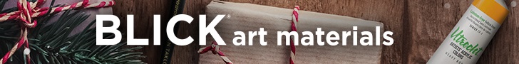
NBr8 Van Dyck / Vandyke Brown made from pigment Natural Brown #8, a rarely offered pigment composed of mixed brown earth (coal/lignite, iron hydroxide - goethite, manganese oxide - pyrolusite, peat and random other local minerals found in the ground). This color is fugitive to different degrees between sources (due to the varied chemical make up of ground minerals/coal in locations around the world). This pigment is available as powder from companies like Cornellisen and Son as well as Kremer. Holbein and Roman Szmal offer it in watercolor. Sadly RS rated this color as BW8 (max lightfastness / LFI equivalent), but it is fading substantially within 6 months. I'll be continuing this test for 1 full year (for fair all-season comparisons to hundreds of other colors I'm testing), but in the meantime wanted to warn artists about this issue since it's notable already. NBr8 is looking similar to LFIII rated paints after this duration of exposure (and in general LFI paints show NO signs of fading at 1 year+ sun).
--- Carmine or Cochineal NR4 ---
This red dye is laked from the cochineal insect. When the red fluid from this bug is bound to aluminum salt the dye is considered a pigment, a more solid sedimentary state. This pigment is commonly found in lipstick and other makeup products as well as a food colorant in licorice/red candy. It is sometimes used in watercolor such as less commonly used brands like China's Super Vision and Germany's Kremer Pigments.
--- Rose Madder Genuine (root of the madder plant) NR9 ---
Also referred to as a lake pigment "Rose Madder Lake" (regarding "lake", see dyes below). Surprisingly durable in masstone, the majority of fading in this pigment is only when extremely diluted (at least 50% water to pigment ratio). Winsor and Newton Pro Watercolor:

--- Rarely used pigments - Mayan colors, Sicklerite, Rhodanite. ---
Four Daniel Smith "PrimaTek" colors. The "Mayan" colors are also available from Turner and pigment powder sources, all of which are weaker (sometimes being prone to streakiness/texture issues) as well as being less lightfast than desirable.
Made from minerals, gemstones and reproduction of ancient Mayan pigments not commonly used in any other brand or art material. Due to that, many of these types of colors do not have common pigment code numbers. The Mayan colors were rated as LFII, which is close but the diluted range is showing more significant fading than present in other LFII paints.

Their website notes the Mayan colors as being dupes of colors that "despite exposure to severe heat and humidity, the color has hardly faded over a thousand years"... That was vague enough that I'm not sure that they meant outside walls, or inner caves/buildings and therefore protected from sunlight? They certainly faded from my window lighting.

Modern reproductions of ancient Mayan colors: Supposedly environmentally friendly. Mayan Blue: LFII in masstone, but fading can be more severe when diluted LFIII-IV. Mayan Violet PV58: --- LFII in masstone, but fading can be more severe when diluted LFIII-IV. Mayan red also fades, but it is on par with LFII in diluted range.
Sicklerite: This brown mineral is rated LFI but has shown minor fading in over the 6 months to 1 year of nearby window light exposure. While minor, this is definitely closer to LFII level fading in masstone and can be LFIII diluted (blue wool scale indicates BW6, varies with diluted rate of at least 50% water).
Rhodonite: A beautiful pink stone that creates a delicate cool-red to pale-pink similar to PV42 Quin. Pink in its diluted range. It lacks the unique granulating, shimmer or color separating characteristics of Daniel Smith's other mineral paints. Combined with it's fading for a paint that is rated as LFI, I would pass on this one.
--------------------------
ENVIRONMENTAL FADING ISSUES (NOT DUE TO UV LIGHT):
There are a few pigments that can change color or fade over time due to exposure to humidity, chemicals, changes in PH/acidity levels, and repeat heat exposure (such as sunlight even in beams that come into a room at sunset each day). Some colors, like Malachite, can also start their color change process (in this case from a cool green to a warm green-yellow) due to exposure to metal rollers or tubes at the factory, even if sold in plastic pans later.
Environmental changes have been detected in: PV14 Cobalt Violet, PG24 Ultramarine Green, Sodalite, Malachite, Vivianite and Azurite minerals.
---------------------------

Its popularity and demand dwindled by the 1960s. Kremer Pigments, a German based dry pigment supplier who also offers a small collection of rare ready-made watercolor paints, is the only large business currently offering PG24. It is very opaque and is similar to Cobalt Green Deep in masstone. The color separates to expose an ultramarine blue color when salt is applied, suggesting color separation as well as granulation when used in very wet washes. The green fades with UV exposure, almost entirely returning to a standard Ultramarine Blue color within 6 months of window light.

--- Pyrrol Orange PO73 - sensitive to long term repeat exposure when diluted - noted only due to a problem for tints in outdoor/mural settings. ---
Little to no change when used in masstone. Caution in extremely diluted range for long term light + heat exposure. While PO73 is an extremely durable orange, particularly in masstone, it is not ideal for outdoor murals or office buildings with large glass windows allowing sun ray heat to hit the artwork repeatedly over time. Problem for long term display (office, gallery etc.) with repeat UV or environments using Fluorescent bulbs.


NOTE: PO73 is NOT universally fugitive in every brand/medium/thickness. It appears that this pigment is only notably fugitive when VERY DILUTED or in mixture/pastel tints that receive heat/sun repeatedly long term. This would be a very acceptable orange pigment for most artists, but care is needed for outdoor projects. Widely regarded as extremely lightfast (BW7-8, LFI) when in mass and midtone, it suffers only when UV exposure is prolonged (or consistent over a period of 6+ months, such as daily sunsets) and the paint was diluted (est. with more than 60% water).
Be wary of Cadmium Orange Hues when considering other orange paints, especially ones without pigments listed. The Winsor and Newton watercolor had dramatic fading for being rated lightfast.

In the Winsor & Newton watercolor lightfast test above, you can see there is minor fading present in the diluted swatch for PO73 Winsor Orange Red Shade. This is not dramatic, being roughly equivalent to LFII level fading. However, if you dilute it with water even more this fading can increase. This can be problematic in buildings that receive even an hour or two a day of sunrise/sunset beams of light through the windows.

While not as fugitive as PR177 found in the popular Daniel Smith color "Moonglow", I did see signs of fading in the color called Shadow Violet. PO73's fading also causes a loss of warm hue in the similar color by Paul Rubens called Moonlight Purple. When PO73 is such a small part of the mixture, the overall lightfastness suffers. I have mixed feelings about calling this paint lightfast when there's an "IF" statement attached. NEARLY ALL BRANDS OF PO73 ARE MORE UV STABLE AS A SINGLE PIGMENT, instead of very diluted down as multi pigment mixtures. PO73 typically does very well in lightfast tests, showing little to no fading in masstone and about 50% diluted with water even after a full year of window sunlight.
This color is one of the most bright purple-pinks available for a highly granulating color. It pains me to remove it from my palette due to its usefulness in florals and creating color separating mixtures. It's an expensive pigment that is sometimes hated by artists for being gummy and weak, but it offers a unique color range and textural mixing properties otherwise not possible with any other currently known pigment. Unfortunately I live in Florida and it is more important to me in a warm humid state to abandon the use of it than it would be if I lived in a cooler dry northern climate. Here are the lightfast test results and my conclusions about the problem with this pigment:


In addition to my finding that Sodalite changed over time (elaborated upon on my Daniel Smith review page) I've also heard speculation that this mineral varies by batch. This is not the case in my sample, but it is also possible that people are getting a cool black with very little blue color from brand new tubes/pans. I did notice a negative review on Jackson's from someone who tried the dot card, loved the blue granulation and was upset to find that the tube she ordered was black-gray. See the paint availability and if that review is still up at Jackson's website here.
Malachite - PG39 natural mineral pigment is lightfast, but is chemically unstable and discolors for reasons other than UV light. It yellows from acids (possibly an interaction with gum arabic and honey binders). It is also possible to discolor or darken from environmental factors such as atmospheric sulfides, humidity/PH, air pollution and other chemical reactions. Several artists have mentioned yellowing in humid climates (I also live in FL and this possibly came into play for the 3 samples I had yellow as well). The dry paper swatches remained stable but pans yellowed (the binder keeps them semi moist). I can only speculate that painting with them possibly diluted the binder enough to stop a reaction once on paper, or it was halted because of being totally dry. Watercolor pans from Daniel Smith (who discontinued this problematic pigment years ago, but not before many customers complained about unusual hardening within the metal tubes), as well as Roman Szmal, Kremer Pigments and handmade (etsy PoemsAboutYou) have all hardened becoming more difficult to re-wet on top of yellowing.

--- DYES (and sometimes "lake" pigments made from dyes) ---
The majority of DYE based products fade over time. Many dye colors show signs of fading in as little as a few days to weeks with nearby window lighting which is quite fast in contrast to stable pigments that can last many years with constant UV exposure. Dyes are an easy thing to avoid once you realize which products are prone to including them.
Dyes are available as printer inks, fountain pen inks, inside Copic and other markers for illustration, as well as "liquid watercolors" that don't specifically state "pigment based" as well as craft supplies like ink sprays, rubber stamp pads, brush pens and alcohol inks. Dyes are also frequently slipped into pigment based products that are called opera,neon, bright or brilliant and marketed to professionals as "designer" paints that are abnormally vibrant. Dyes are capable of achieving bright neon colors artists might want for botanical, neons, street lights and other design elements that require fugitive fluorescent colors to replicate.

Dyes are typically an intense or vibrant transparent liquid. Often man made, chemically altered or extracted for it's vibrant qualities. Dyes can be made in a lab and sometimes extracted from plants where the bright color is taken away from the rest of the plant matter in a liquid state. In this state it can be used to dye clothing (such as indigo dye), or similarly dye particles like salts and polymers to become thick enough to use in a paint (which is often referred to as a "lake pigment" meaning a dye coated base particle). On rare occasions a color named "--- lake" can be lightfast, but it's good to investigate any testing information on the specific one in question. In general dark dyes such as browns and blacks may be less prone to fading than bright pinks, reds and purples.
Dyes offer bright saturated color not typically found in lightfast natural minerals, so many people choose to use dyes even though they are fugitive because they offer vibrant colors that you can not achieve with more stable pigments. "Opera Pink" is very popular among botanical artists who otherwise struggle to replicate bright floral pinks.


Some artists are not aware that they can be frequently found mixed in with pigment based watercolors, gouache and acrylic. Dyes are most frequently found in art supply products like "liquid" watercolors (ecoline, radiant), markers and alcohol ink. They are also used as a way to boost the vibrancy in all "FLUORESCENT" COLOR paints such as most brand's "Neon" colors or the super common "OPERA PINK" which = PR122 + DYE. It's the dye that is fugitive, not the PR122.

Dyes are also common in "designers" gouache, liquid watercolors like ecoline, radiant, "watercolor brush pens", Copic markers, inks etc.

Opera Pink or Rose is also sometimes called Neon, Opus, Vivid Pink or colors starting with the word "Bright" or "Brilliant" in some brands. There is a lot of mystery around this watercolor because certain brands only disclose that it is made with the pigment PR122. Technically it's a pigment list, and in their opinion dye doesn't count as a pigment so it's not stated. Some label it as LFII, some say "NR" for not rated, others only LFIV or * of *** stars. By not disclosing the dye, they imply that it's PR122 that fades when it's actually the fluorescent dye mixed into it. Most commonly a vibrant red dye like BR1 or the bright pinkish violet known as "BV10" is added as a liquid to the binder. BV11, BR12 and other dyes are often found in designer gouache paints. These colors can drastically fade in a relatively short time even indoors from nearby window lighting. This fading varies by brand and how much dye was used with signs appearing in a few weeks to a few months. There is a problem with accurately color scanning dyes, which is bad for print reproduction. Cameras struggle to detect the same reflected light from the fluorescent dye that your eye can see. Often the scan or photograph will appear dull and need to have the brightness and contrast edited in computer software.
FLUORESCENT DYE and OPTICAL BRIGHTENERS can be CLEAR/WHITE making them invisible to the naked eye in normal lighting. These additives often evade detection on the consumer end. In rare cases the UV black light reactive glow can be caused by the presence of fluorite or other natural mineral, such as that in Blue Apatite by Daniel Smith. It is possible that an optical brightener (sometimes called a whitening or fluorescent brightening agent) are also added to Blue Apatite (as Daniel Smith has stated that they sometimes enhance the mineral colors with supplemental ingredients for less batch to batch variance).
All of the fluorescent effect will fade over time, but was essentially invisible in daylight, being mostly visible only under black light. "Manganese Blue Hue", which is made with the optical brightener similar to a fluorescent dye mixed with Phthalo PB15 (also present in "Lunar Blue") stops reacting to black light within several months of sunlight exposure. The remaining blue that was visible in normal light is LFI to LFII.

--- UPDATES ---
This page is currently in progress. I am running tests on over 500 colors from dozens of brands at this time. As results come in over the next year this page will continue to receive updates.
Happy painting,
Kimberly Crick
Check out the pigment database if you'd like to learn more about pigments and how certain colors compare across different brands.
Want to know when something is added to this page? See Patreon.com/kimberlycrickart for swatch card and LF test result updates, line art drawings for practice painting and more.
I also make videos with painting demonstrations at YouTube.com/kimberlycrick
Where do I shop for art supplies?
My favorite American art supply chain store is Dick Blick. They have a massive catalog and competitive prices, with quick shipping options here in the USA.
One of my favorite places to shop for a world-wide selection watercolor paint and brushes is Jackson's. They have affordable shipping to the USA and a lovely selection of items not easily found in American stores.

Amazon USA continues to offer more and more art and craft supplies that can be found no where else. They often have import sets, such as Chinese brands like Paul Rubens, that are not available in the more common art stores. This page contains affiliate links. As an Amazon associate, I earn from qualifying purchases.
For craft supplies, such as Tim Holtz Distress or Alcohol Inks, Alt&New, Art Philosophy and Prima Marketing watercolors, alcohol or dye inks, stamp pads, markers etc. I shop at:
Scrapbook.com: Thousands of scrapbooking supplies. HUGE daily discounts!
Note: this page contains affiliate links. All product opinions are my own. I am committed to honest reviews showcasing both the pros and cons of each product. I have not received payment from any brand for a review. I earn a commission from sales made through this web page's clickable banners or links to Amazon, Arteza, Scrapbook, Jackson's or Blick Art Materials websites.