Old Holland Watercolor Review, Pigment Code Color Chart, Lightfastness, Swatch Cards.
Old Holland classic watercolors are professional quality, highly pigmented, easy to re-wet paints that lift easily. Their unique binder formula causes the paint to dry
shiny but non-tacky. This also causes the dried paint to be rock hard which can easily fall out of the pan (a potential problem for travel palettes). Though they carry mostly staining colors, they life (erase with a damp brush after dry) easier than common gum arabic-only formulas. Old Holland offers some
rare / brand exclusive pigments (PO34, PO65, PO67, PY120, PR251) as well as carrying some problematic pigments prone to being weak (PG23, PR259) and more than a few fugitive ones (see color charts with pigment info further down).

Old Holland has been distributing their paints across the world for several hundred years, being one of the oldest established paint companies that exist today. Their "Classic Watercolours" are influenced by China and Japan's traditional paint making methods. Due to this influence, despite being made in Holland, these paints perform more like Asian watercolor brands and Gansai. They openly claim to use gum arabic and glycerin, but if you dig for further information you can find mention of rabbit animal-hide glue, honey and sugar syrups. Some artists have reported a gummy, thick texture as well as poor re-wettability from tubes that were dried. There is a slight smell when re-wetting these paints, similar to Elmer's school glue. The pans seem to be better formulated to re-wet from a dry state than the tubes, possibly due to a different binder ratio.

Major negatives: There are several reasons I do not generally recommend this brand. The tubes and pans are not labeled in a standard way, there are no pigment code numbers, transparency or staining info or ASTM LF ratings. They do give the chemical name (in a very uncommon format). For those looking to learn pigment codes (which help you easily identify your favorite colors by ingredient instead of a made-up color name as well as avoid buying duplicate pigments they already own) this is not very convenient. There are a lot of convenience mixtures, with more than a couple containing fugitive colors prone to fading. Most of all the PRICE is unreasonably high. IF you decide a couple colors are worth the investment, I prefer the pans (less binder gloss or separation issues than their tube format).

Purchase advice: Be sure to compare value to other brands that carry the same pigments. For me, only the most rare colors were worthwhile investments. I do not regret trying Golden Barok Red PO65. It is a beautiful autumn/rust color similar to transparent red iron oxide PR101, but stronger and a touch more orange. It is very useful for landscapes and portraits, diluting to a peachy skin tone. I also enjoyed PO67 Coral Orange, despite it being very opaque (limited usefulness in layering). PO67 is very close to Cadmium Orange (PO20, or slightly warmer red leaning PR108/PY35 mixtures). Because Cadmiums can still be found in other, more affordable brands, I can only see PO67 being of interest to pigment collectors/enthusiasts of rare chemicals.
The pan set assortments do not seem worth the price, unless you are a botanical artist looking for a general assortment of easily lifting floral colors (and don't mind if a couple are fugitive). The 36 set mostly contains common pigments you could find in cheaper sets. There are a few opaque pastel colors that have limited usefulness (again, likely aimed at floral artists including lilac/lavender/peach colors made with heavy loads of PW4). The pastels can be used gouache-like on darker papers and are definitely less desirable for layering (opaque colors do not layer for deeper values). If using opaque colors on dark papers is of interest to you, brands like ShinHan or White Nights offer less expensive options.

This 36 set (swatched below) contained some weak, problematic and fugitive colors, redundant mixtures and
none of the rare pigments.
PG23 Green Earth is weak, and hard to re-wet as it always is in any brand, but this version was the worst of any I've tried. It was barely able to tint the water a muted swamp green.
PB27 Prussian Blue is fugitive and also has texture issues. I have seen this odd gritty flocculation (different than pleasant granulation texture) in student brands like Cotman and Aquafine, but this was the first time I've seen this in a pro grade. Having two colors be useless in addition to at least three fugitive colors and some colors with limited usefulness just doesn't seem worth it compared to far cheaper sets from brands like
White Nights or
Paul Rubens.
Pros: On the bright side, as a fan of granulating and special effect paints, I did appreciate the subtle color separating properties of the following colors. Most notably - "Van Dyck Brown (Cassel) Extra", and less so in "Payne's Grey", and minorly in wet washes of "Olive Green Dark" and "Indigo Extra". The botanical colors are lovely and useful if you happen to paint flowers a lot. The Alizarin Crimson Lake Extra is a stunningly beautiful rose red, but I wish they had not included PR177 in this mixture. Unfortunately several of the floral colors contain fugitive pigments like PR112, PR177 and PO34, which fade when diluted (more stable if you use them at full strength). They are still beautiful paints though and could be used for work meant for scanning to make prints.

Old Holland has made the claim that "all 168 colors are lightfast" - which should never be assumed for so many colors. They carry more than a few unreliable pigments known to be fugitive. PB27, PR177 and PY40 fade in any brand. PY120 Scheveningen Yellow Medium (PV Fast Yellow H2G a form of Benzimidazolone) fades and darkens to a brown color similar to the behavior of Aureolin PY40. Their Madder (crimson) Lake Deep Extra is PR83:1 (synthetic Alizarin Crimson) which fades as badly as LFIV-V. PO34 Scheveningen Red Scarlet is not a commonly used pigment in other brands and an old version sold by Lukas brand was extremely fugitive. Some colors were never even evaluated by ASTM, yet Old Holland falsely claims "all colors are rated ASTM LFI-II". Scheveningen Purple Brown (PR175-Benzimidazolone Red) is a rarely used pigment, but it is likely lightfast regardless of not being well tested in watercolors. Daniel Smith offers it more affordably as "Deep Scarlet" (which they independently rated as LFI). To be fair regarding Old Holland's claims, a lot of modern pigments are much more lightfast than old outdated pigments that are rarely offered by any company anymore. For over a hundred years they carried many toxic pigments prone to fading, because they were through the Dutch East India company (1600-1800 was a period of extensive trade between the Dutch and Asia). In recent years they have expanded to include modern pigments with less toxicity or better lightfastness.


They had taken pride in offering historical pigments in the past (referring to old "master" artists using them in their work). Sadly Vermillion (contained mercury) and Manganese Blue (an extremely granulating bright sky blue that rivaled the texture and toxicity of any Cobalt) have been discontinued due to how hazardous they were. These colors have never quite been reproduced accurately in replica hues. Paul Rubens still offers Cinnabar, Realgar and Oripment (toxic mercury based pigments gathered near lava formations) but I have not found a
non-toxic look-alike for granulating orange colors.
Regarding Manganese Blue replacements, I like Daniel Smith's Manganese Blue Hue made with a custom fluorescent variant of PB15. The hue was very closely matched to look like PB33 and it also granulates nicely. Kremer Pigment's Zirconium Cerulean PB71 is a very actively granulating dusty sky blue, but it is considerably more opaque and has a muted, chalky appearance. It is hard to replicate the true beauty of the original PB33 pigment, which is slightly more bright blue cyan-leaning than the dull cerulean blues (PB35/36) or teal-leaning cobalt turquoises (PG50).

As one of the most expensive brands in the world, that also happens to also be very quirky, they are not a popular choice. Many of their paints are about double the cost of most pro-grade brands (about $10/6ml vs a more common $10/15ml). As a downright crazy example of price point for their most expensive colors, I recently saw a tube of Cobalt Violet going for $30 (sale from $40) for a tiny 6ml tube. The pan sets can go for over $300 or more for up to 36 half-pans. While some rare pigments, like PR251 may be tempting to try for collectors of color, prices like these really deter just "trying" them:

They have some odd, non-standard practices in this paint line in addition to lacking proper lightfast ratings or pigment codes. The labels often have vague chemical names written on them (ie. "Barium Manganate" instead of PB33). It's odd to see that their transparent colors are indicated by the word "lake" in the name. In other watercolor lines, "lake" is a dye, which happen to often be fugitive. Here it only appears to be mentioned so you know which colors are ideal for layering / glazing.
Because the pans/tubes are not properly labeled AND their website requires multiple steps to see pigment codes with the colors, I have created the following color charts for better reference. You can find further info about each paint in their extensive 168 color catalog at
https://www.oldholland.com/watercolours/
Old Holland watercolor chart with color index number codes, rare / brand exclusive pigments and lightfastness notes.

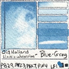
Old Holland scans of my hand painted swatch cards:


NOTE:
Manganese Blue (genuine) has been discontinued. PB33 is no longer available as a pigment. The new formula looks like a cross between Phthalo Blue and Green and I recommend Daniel Smith's Manganese Blue Hue as a replacement for this granulating vibrant cyan/sky blue.
If you'd like to see how any of these individual colors compare to the same pigment in another brand, check out the pigment database.
Where to buy?


Note: this page contains affiliate links. All product opinions are my own. I am committed to honest reviews showcasing both the pros and cons of each product. I have not received payment from any brand for a review. I earn a commission from sales made through this web page's clickable banners or links to Amazon, Arteza, Scrapbook, Jackson's or Blick Art Materials websites.